GastroSocial
The project
GastroSocial combines the compensation fund and pension fund of the hotel and hospitality industry throughout Switzerland and offers social insurance. It is the largest association compensation fund and association pension scheme in Switzerland. Now the big company needed simple and professional icons for their intranet, to make their platform more easy to understand and visually appealing.
What I did
Together with a few team members of GastroSocial, we started with defining the style of the new icons. The old ones were very bold, heavy and old fashioned. 48 of the new icons for GastroSocial I created myself. Around 10 of the in total 58 icons needed for the intranet were taken from an existing icon bundle, which we just had to modify a little bit to make them match our new style.
Icon design
Aeschbachquartier Aarau
The project
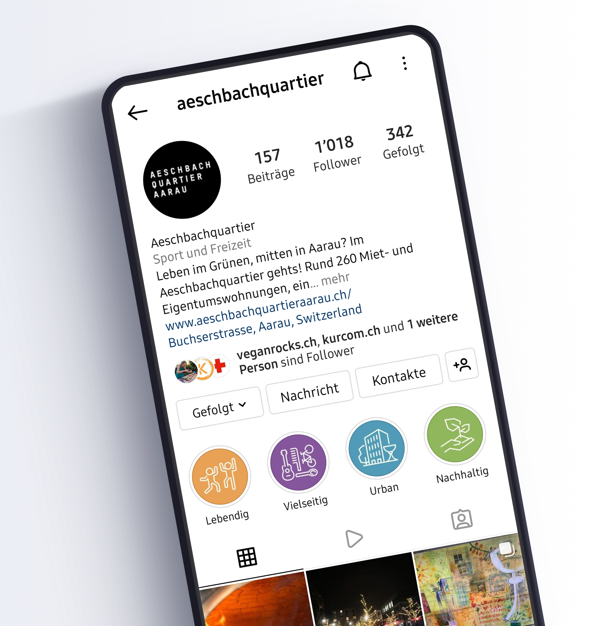
Aeschbachquartier Aarau needed four icons to represent four of their main aspects: sustainable, urban, versatile, and alive.
What I did
I generated various concepts and sketched ideas, established the icon style, and completed the icons for Aeschbachquartier Aarau.
This project was a collaboration with Kurkuma Communication. www.kurcom.ch
Sustainable

Urban

Versatile

Alive


